From 1,000 daily calls to a self-serve ecosystem.
A customer panicking on the highway. A mechanic just doing the job. A garage owner tracking one ticket among fifty. An ops team watching all of it as volume, all four funneled through the same 40 person call center that never let any of them see the same picture. I designed each of the four experiences around how that person felt in the moment, for a roadside assistance company.
Inbound calls to the call center, mostly status checks eliminated by live tracking
Faster average job dispatch, from manual phone assignment to automated job cards
Customer complaints, transparency killed the anxiety that drove most of them
Mechanic job acceptance rate, driven by upfront clarity on payout, distance, and job type
Every flat tyre ended in a phone call. Then another. Then another.
The call center handled 1,000+ calls a day, and most were not new emergencies. They were people re-calling to ask where their mechanic was. The call center had become the only interface the business had. Every customer question, every mechanic update, every garage query, all of it went through a phone line handled by roughly 40 agents.
It's 9 PM. Priya's car won't start in a parking lot. She calls the helpline. An agent manually notes her address, calls three garages to find one available, calls back with an ETA, and updates a spreadsheet. Priya is left in the dark, calling again every 15 minutes. The garage gets a call saying "we're sending you a job" with no context. The mechanic gets a WhatsApp message with an address and a prayer.
How I gathered evidence: structured conversations with the ops lead, PM, and the team members closest to the problem. I pushed each conversation for specific examples and numbers rather than opinions, so every insight on this page traces back to a real account, not an assumption.
4 users. 4 mental models. One connected system.
The goal: build a connected digital ecosystem so every stakeholder, customer, mechanic, garage owner, and ops team, can self-serve. Eliminate the call as the primary coordination mechanism.
Before designing a single screen I mapped how information and actions had to flow between stakeholders. The system lives or dies on one principle: status is the single source of truth. Every platform reflects the same job state in real time.
Each user experiences the same urgency differently. A customer feels it emotionally, a mechanic feels it physically, a garage owner feels it as a business problem, and ops feels it as volume. So each platform got its own design principle, all pointed at the same goal: automate what the call center used to do manually.
Customer
Requests service via app
Ops Dashboard
Receives & assigns job
Garage Partner
Accepts job, dispatches
Mechanic
Gets job, navigates, updates
Customer
Tracks live status
Job Complete
Rating & invoice auto-sent
Customer App: the face of the experience
For the customer, the whole product is this app. They're stressed, car trouble is rarely a good moment. So the design principle here was radical simplicity under pressure. One big action on the home screen. No hunting for menus. Real-time feedback at every step so they never have to call anyone to ask "what's happening?"
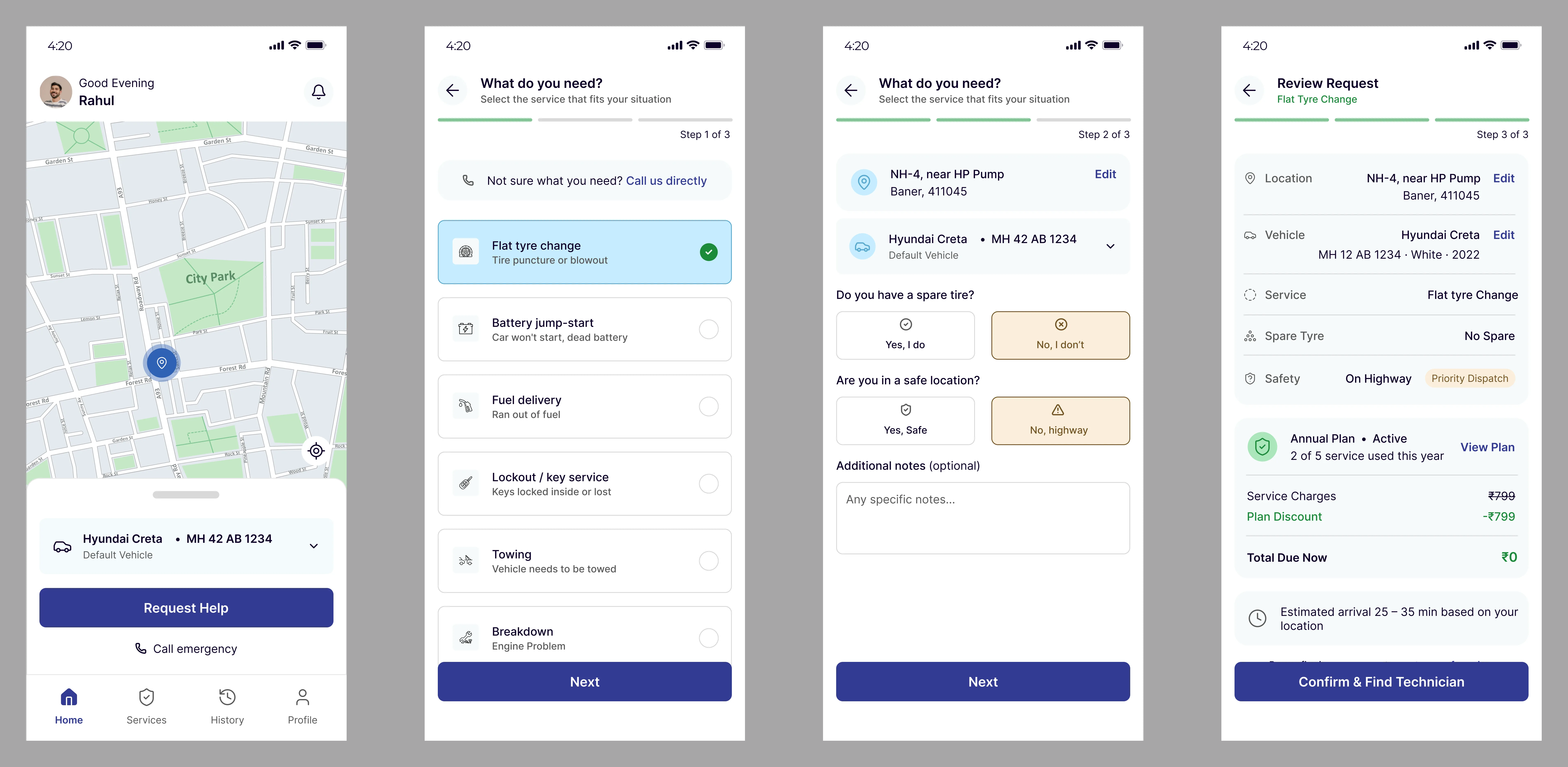
Customer app: request, track, and rate without a single phone call
Ops Web Dashboard: the control room
Internal ops staff are the unsung heroes. They manage 200+ active jobs simultaneously, handle escalations, and keep the SLA green. The design challenge was the opposite of the customer app: maximum information density without cognitive overload. Every second they spend hunting for data is a second a customer waits.
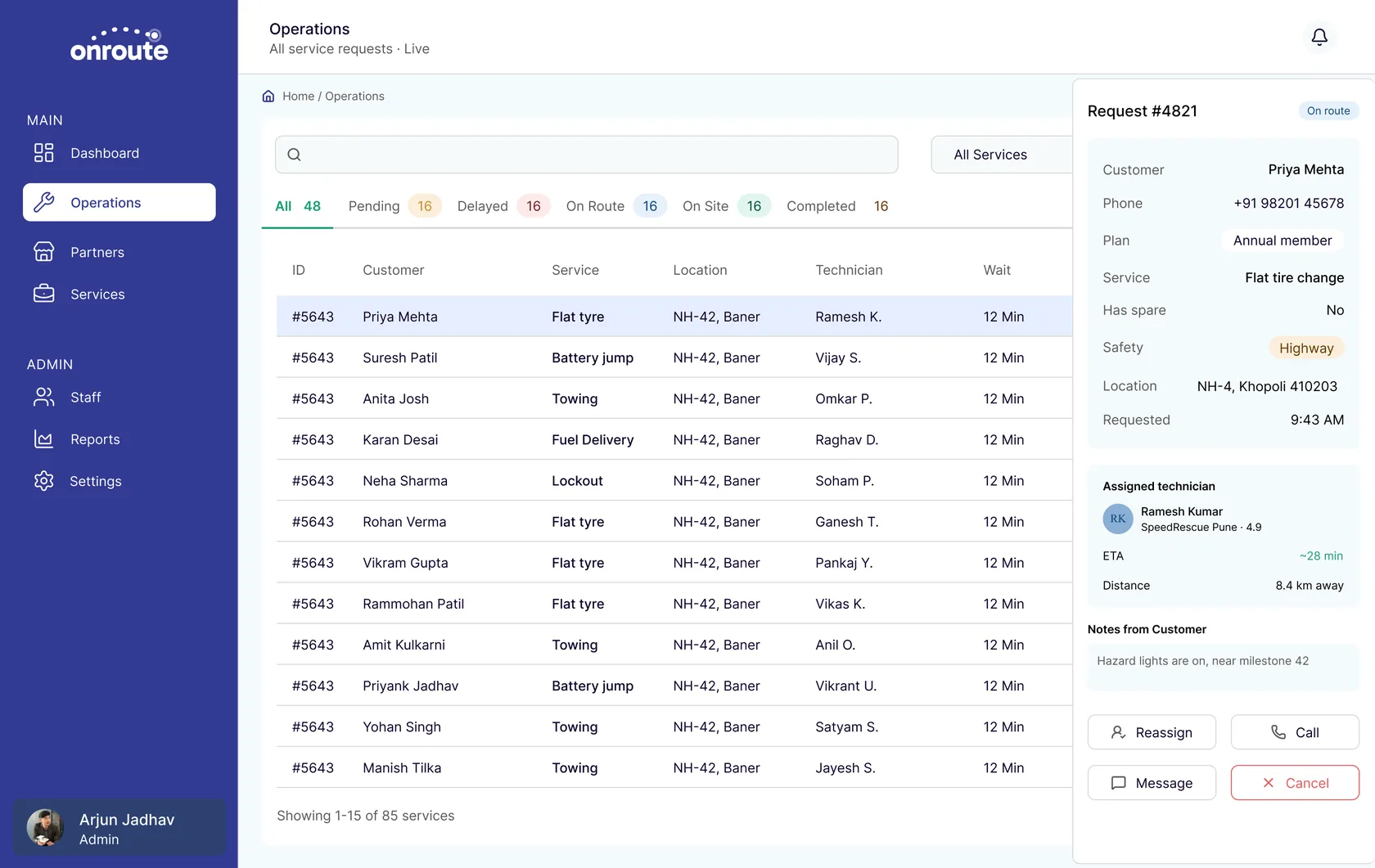
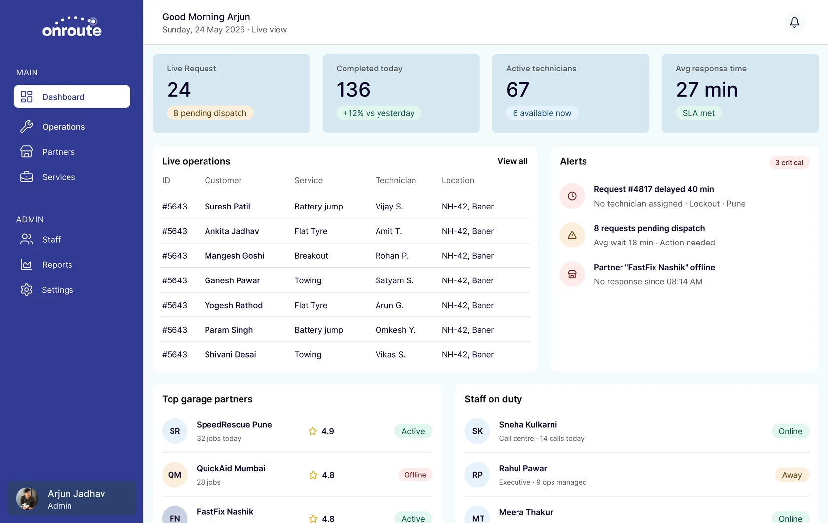
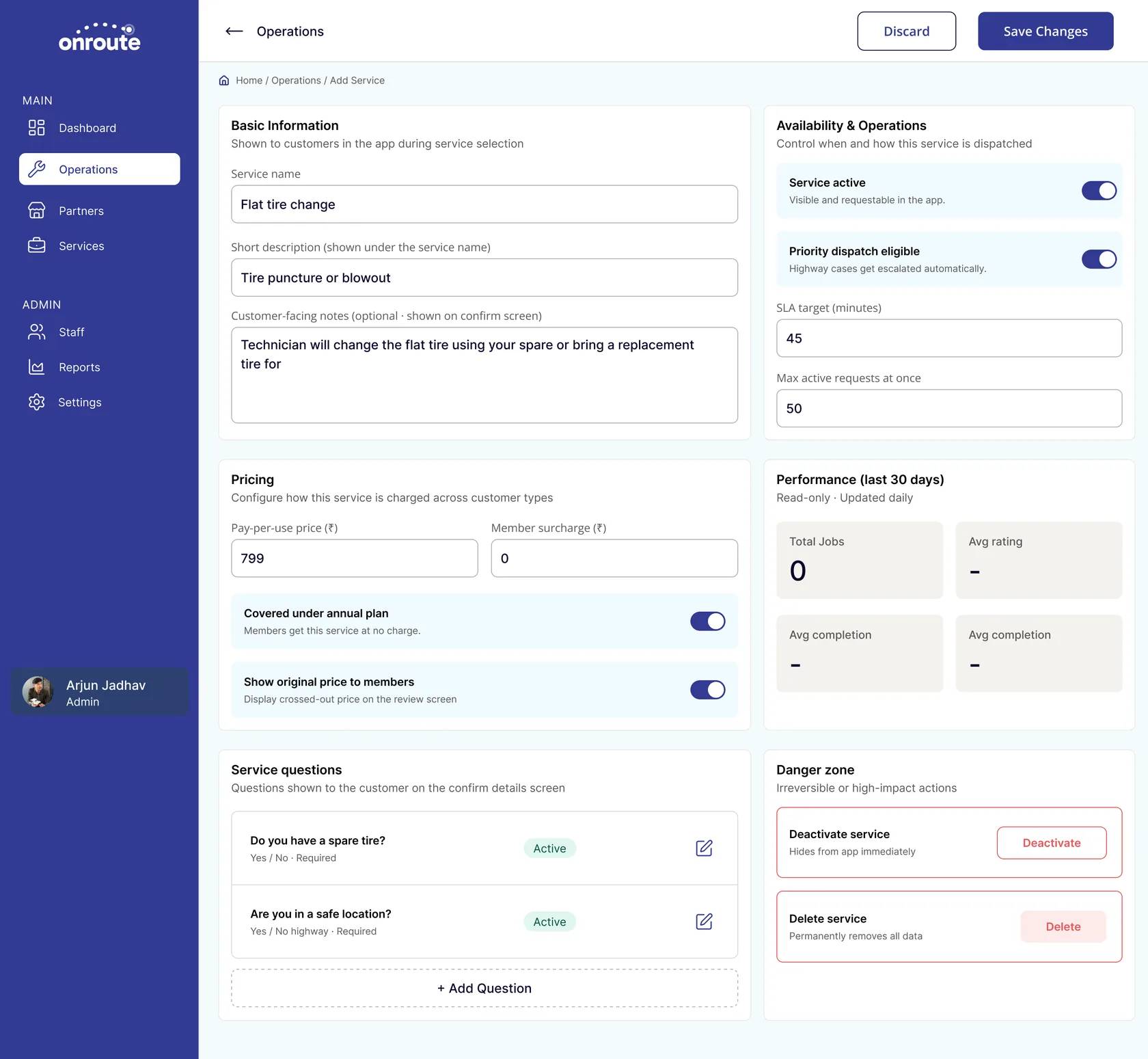
Ops console: 200+ live jobs, escalations, and SLA health in one view
Garage Partner App: the operations hub
Garage partners had zero digital presence before this. They ran their entire business on phone calls and a whiteboard. The design goal: give them a lightweight but genuinely useful business dashboard covering job pipeline, mechanic dispatch, and earnings visibility, all in one place. Available on mobile with an optimised tablet view for the garage counter.
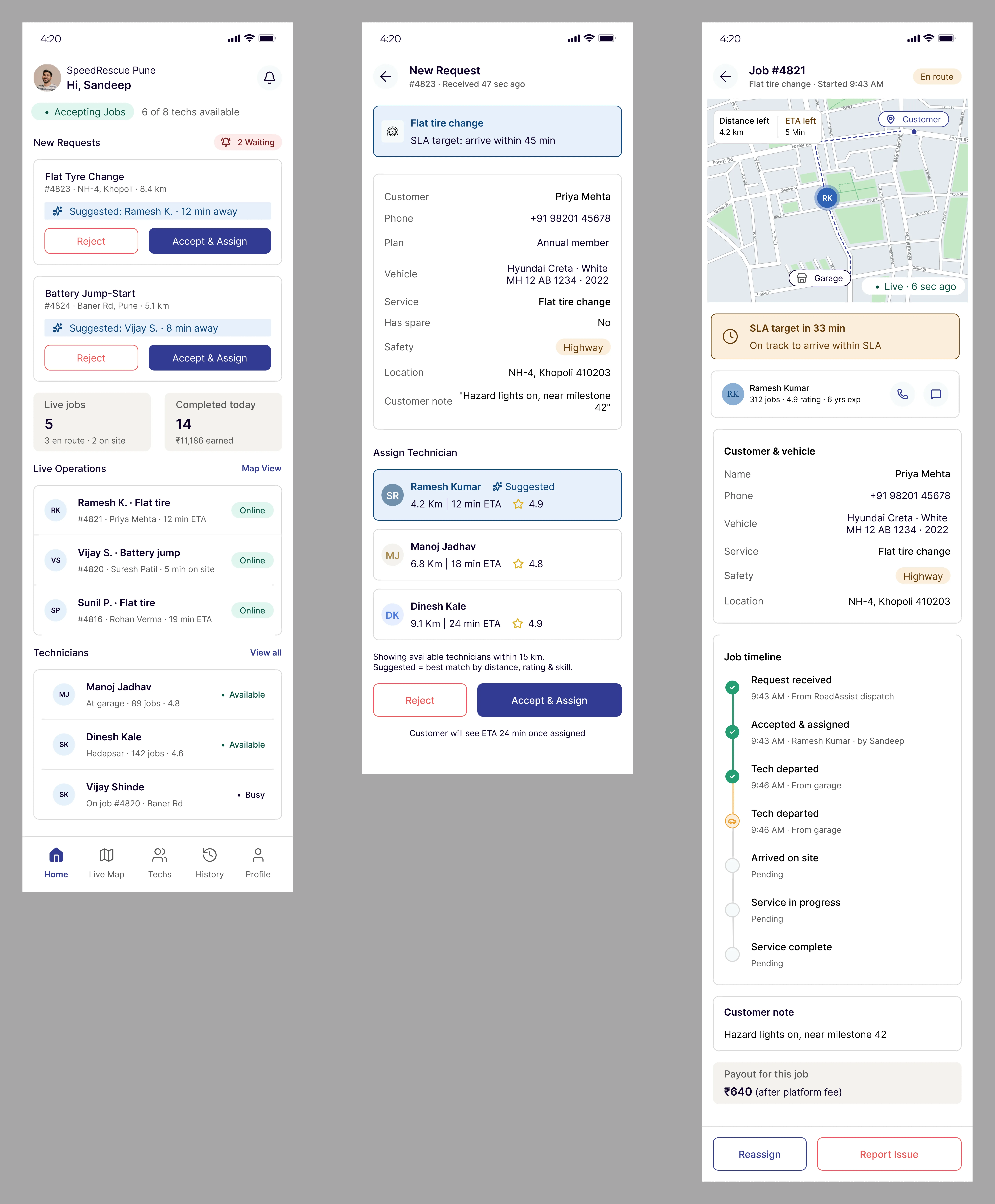
Garage partner app: pipeline, dispatch, and earnings replacing the whiteboard
Mechanic App: built for the road
Mechanics are the most overlooked user in this ecosystem. Before this app, they got a WhatsApp message with an address and figured out the rest. The design constraints were extreme: bright sunlight, one hand, possibly wearing gloves, often patchy signal. Every screen had to work at a glance. The app is offline-first: all job data caches locally and syncs when signal returns.
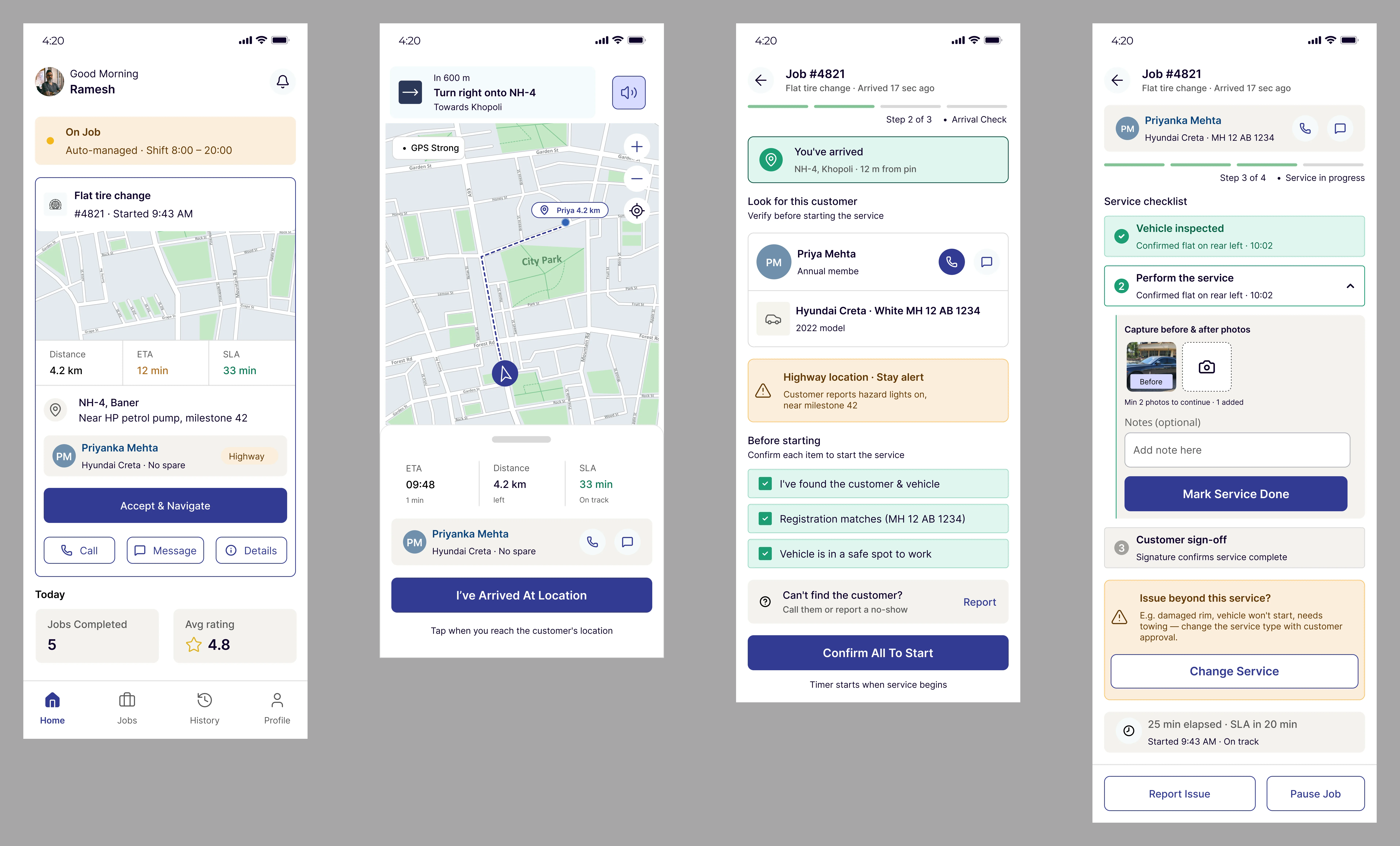
Mechanic app: glanceable, glove-friendly, works with zero signal
The choices that made the difference
Designing four platforms simultaneously meant constant trade-offs. These four decisions shaped everything:
Status as the single source of truth
All four platforms reflect the same job state, updated in real time. No platform shows stale data. This single architectural decision eliminated the most common source of customer calls: people ringing to ask "what's happening?"
Role-based information density
The customer sees three things: their mechanic, the ETA, the status. The ops team sees a full live table of 200+ jobs. Designing the right density for each role prevented overload on mobile and kept the ops dashboard genuinely actionable.
Offline-first mechanic app
Mechanics drive through areas with dead signal. The app caches the current job locally, address, customer contact, service type, so they can navigate and update status without connectivity. Everything syncs on reconnect.
One shared design system, four platforms
I built a lightweight shared token layer: colour, type scale, spacing, and core components that all four platforms inherit. It enforced consistency across wildly different form factors and cut design time significantly on later platforms.
When you can see what's happening, you don't need to call anyone.
The clearest measure of success was call center dependency. Status-related calls dropped by 42%, because customers and mechanics could now see and act on information themselves instead of calling in. Every stakeholder gained the one thing they didn't have before: visibility.
Fewer inbound calls. The majority were status checks, eliminated by live tracking.
Faster average dispatch. Manual phone assignment became automated job card delivery.
Fewer customer complaints. Transparency killed the anxiety that drove most of them.
Mechanic job acceptance. Clarity on payout, distance, and job type drove confidence.
Design the system before designing the screens
The most important document I made on this project wasn't a wireframe. It was the ecosystem map showing how data had to flow between all four user types. Getting every stakeholder to agree on that map before I opened Figma saved weeks of rework.
I also learned how differently each user type experiences "urgency". For the customer, urgency is emotional, they're stranded and anxious. For the ops agent, it's operational, an SLA number turning red. For the mechanic, it's physical, they're in traffic. Designing for the same moment from four different vantage points is what systems thinking actually means in practice.
The best design decision I made was choosing not to design until I understood all four users equally well.