Turning a paper-and-shouting restaurant into a connected dining OS.
This wasn't a blank canvas. There was already a process, carbon slips, a phone calculator for the GST, three people relaying one order by hand, badly, but it worked. Six different interfaces got built around that same live order: a phone screen for the guest with no install, a tablet for the kitchen, an admin view tracking 8 outlets.
A note on scope. I designed the guest ordering, waiter, and HQ admin experience end to end. The kitchen display, manager floor map, and cashier flows were designed independently by a second designer on the team. All six are shown here to represent the complete system.
Three people handled one order. None of them had the same information.
It starts with a customer raising their hand. The waiter comes over, writes the order on a carbon-copy slip, tears off one copy and walks it to the kitchen hatch. The chef reads it, starts cooking, maybe. The slip might be illegible. The table number might be wrong. The waiter has already moved on to three other tables.
Meanwhile, the cashier has no idea what Table 7 ordered until the waiter physically walks over and reads out the items. The cashier punches them in manually, calculates GST with a phone calculator, and prints a bill that might not match what was actually served.
The brief was deceptively simple: connect everyone in the restaurant to the same live order. The execution required designing 6 different interfaces, each calibrated for a completely different user, context, and device.
How I gathered evidence: shadow shifts across three outlets, structured conversations with the PM, outlet managers, waiters, and kitchen staff, and hands-on time with the existing paper flow. Every observation on this page traces back to something I watched happen or a specific person I spoke with.
6 roles. 3 tiers. 1 live order thread.
Before designing a single screen I mapped how information had to flow between roles. The system lives or dies on one principle: every role sees the same live order, at their altitude. HQ sees the chain. The kitchen sees one ticket. Everything in between is calibrated to the person and the moment.
An internal Portal Admin role also exists in the product for outlet provisioning. It's excluded here to keep the case study focused on the six roles with the most design decisions worth showing.
HQ Admin
Web · All outlets, menus, staff
Manager
Web/Tablet · Tables, ops, staff
Cashier
Web/Tablet · Billing, payments
Kitchen
KDS tablet · Order queue
Waiter
Mobile · Assigned tables
Guest
QR → browser · Scan, order, pay
Customer: scan, order, eat. No app, no account, no friction.
The customer experience had to be the most seamless of all. Guests didn't choose this software, they just want lunch. Zero friction meant zero installation: scan the QR on the table, and you're already in the menu. Table context pre-filled. Categories filterable. Cart always visible. The 60-second rule shaped every screen: from scan to placed order in under a minute. Takeaway gets the same flow but lands on a pickup code screen instead of a tracking view.
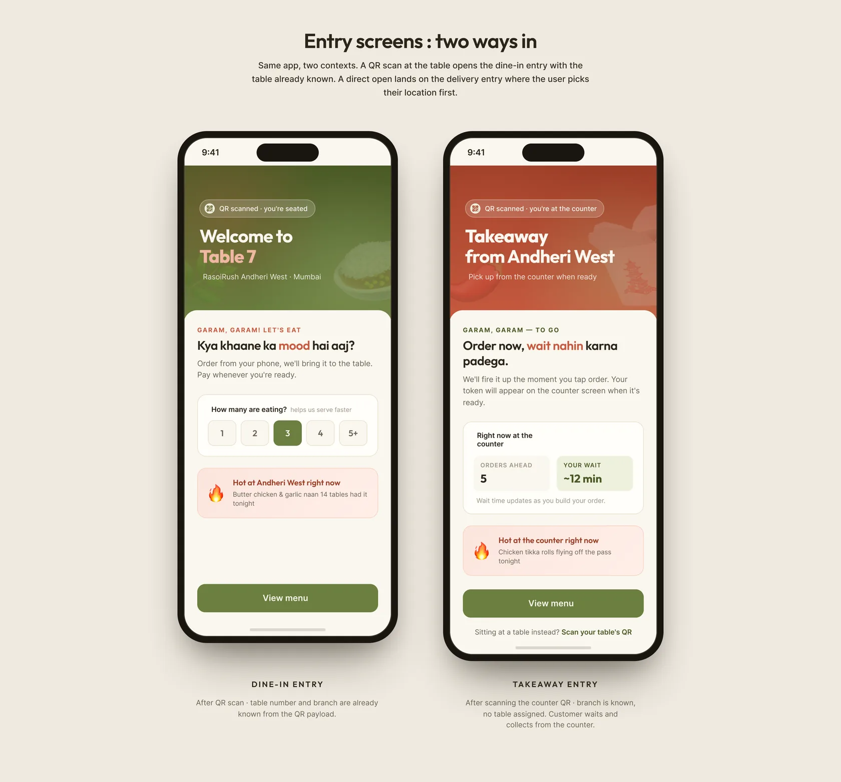
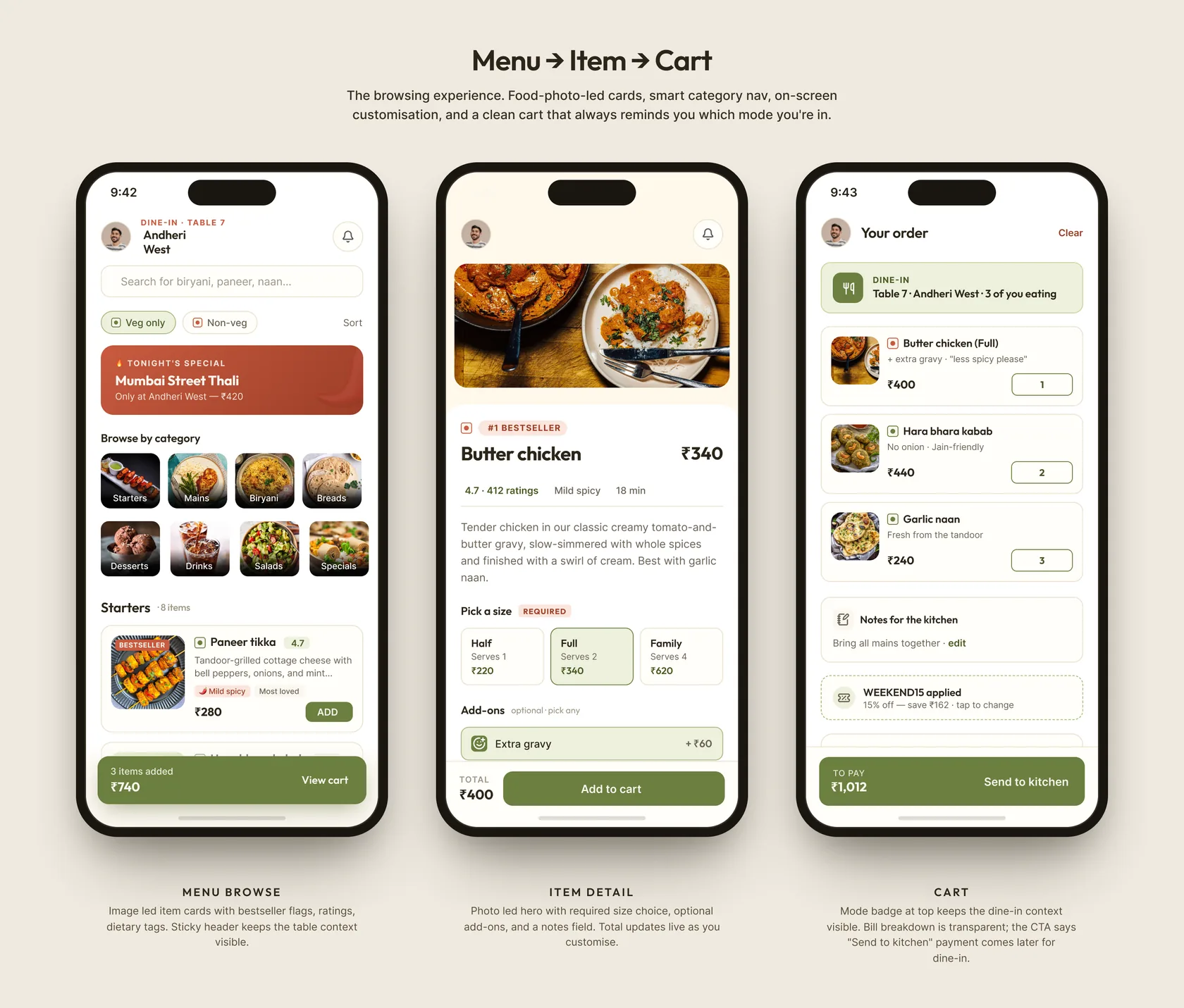
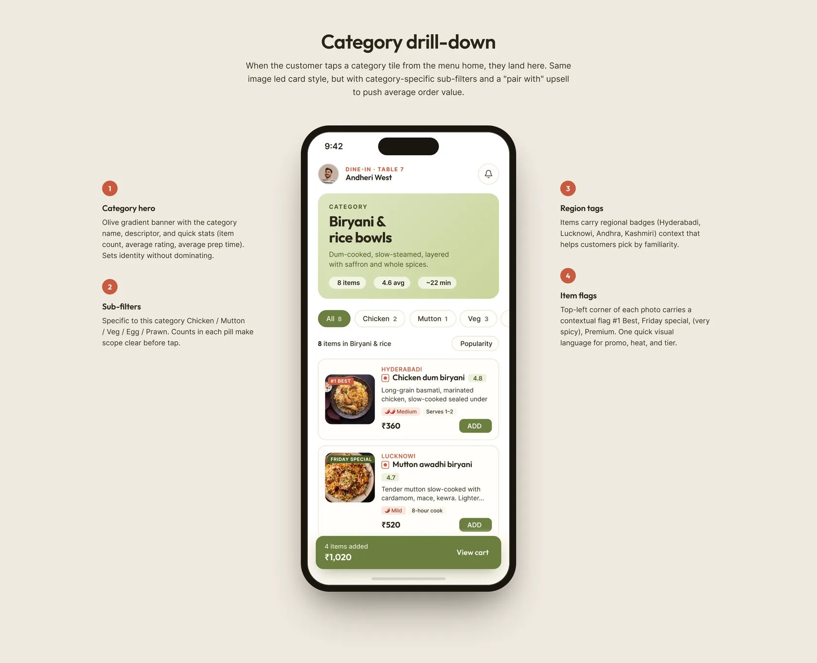
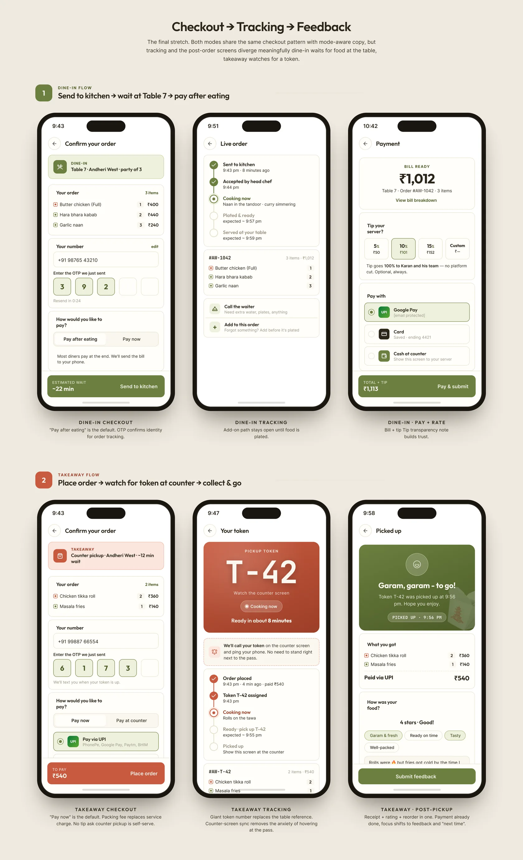
Customer app: scan, order, track, and pay without ever installing anything
HQ Admin: the chain view. 8 restaurants in one glance.
HQ Admin was the most data-starved role and the one with the most to gain. They needed to see live performance across every outlet: orders in flight, revenue ticking up, any outlet falling behind on service time. The design principle was comparison over detail. The dashboard is a table of all outlets, one row per restaurant, sortable by revenue, order count, and average service time. A red cell means something needs attention. Clicking drills in. Everything else stays high-altitude. Menu management cascades from here: create a new item, toggle availability, push to all outlets or just one.
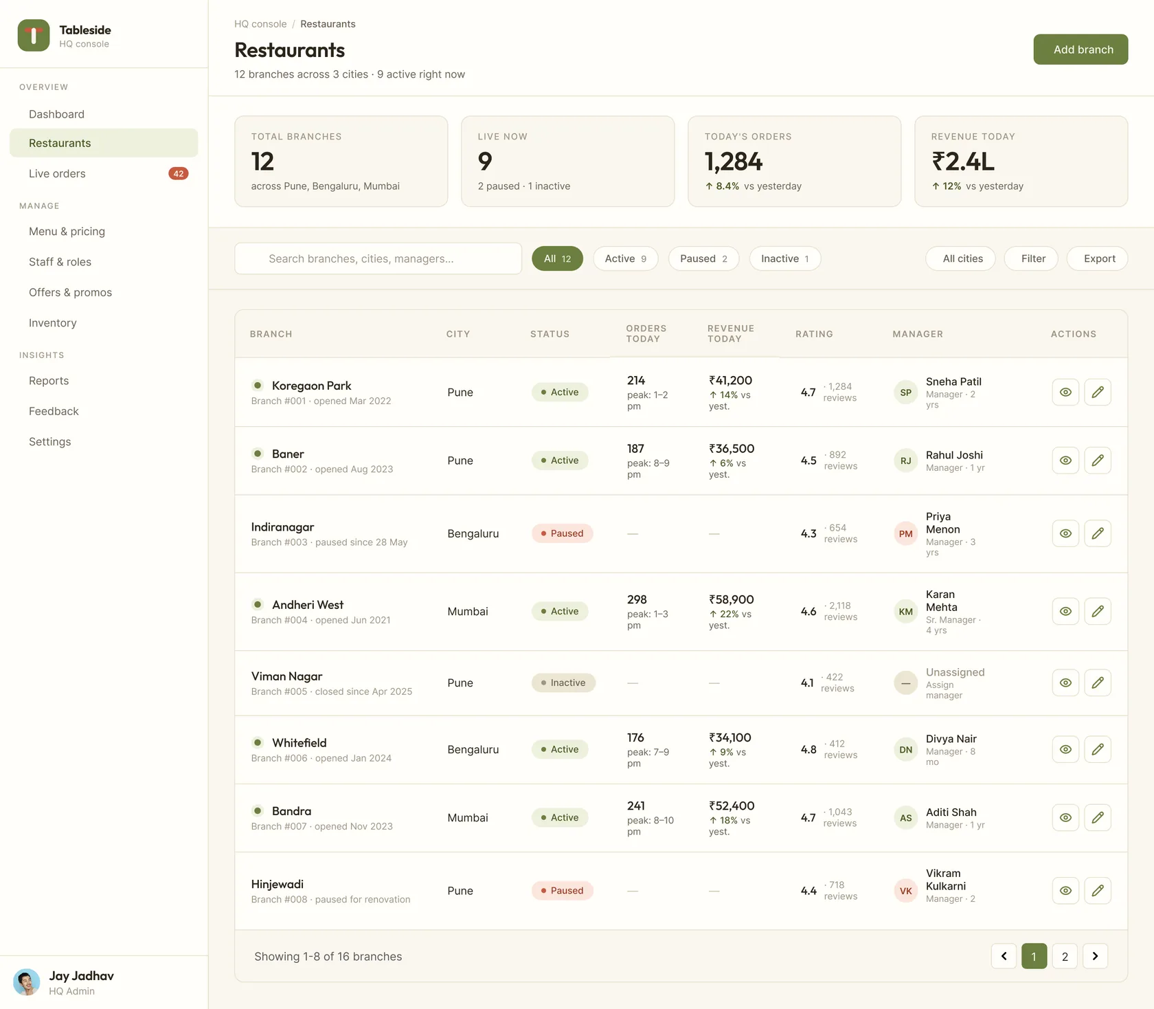
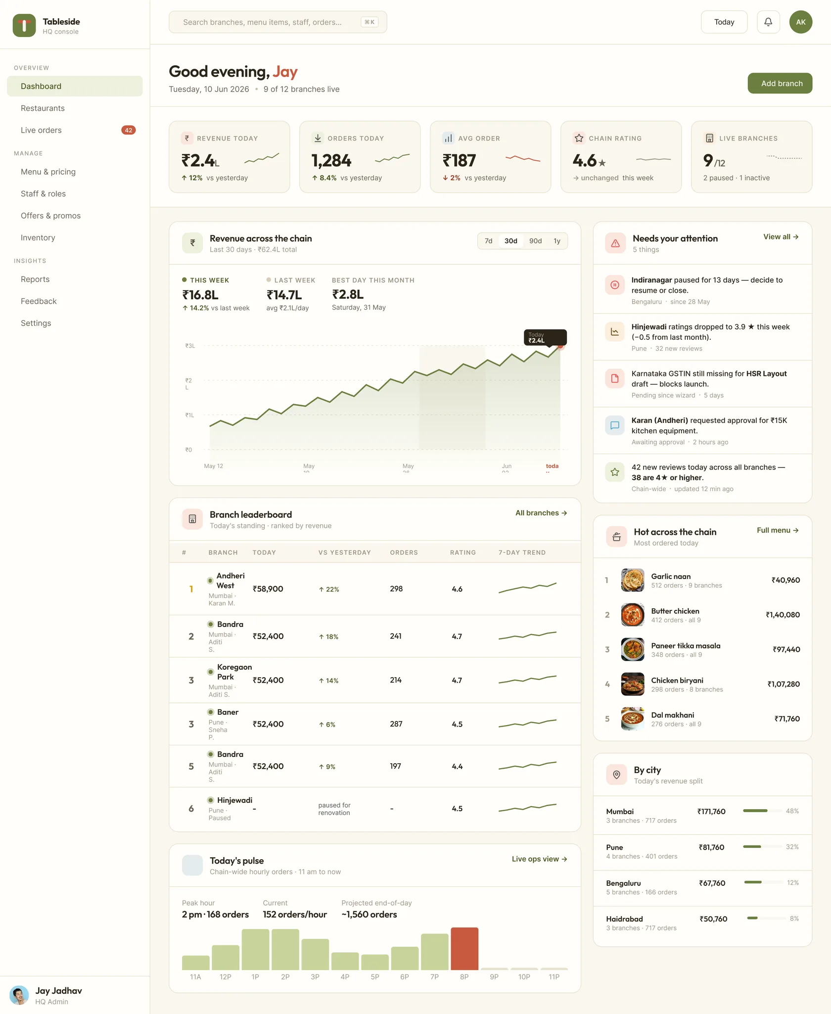
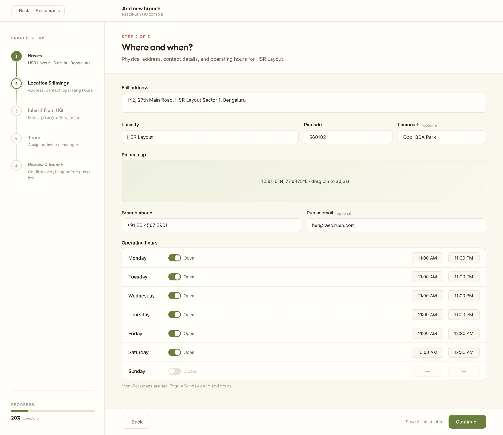
HQ console: eight outlets, one glance, edits that cascade downstream
Manager: the whole restaurant, at a glance, with the right alarm at the right moment.
The manager's job is to spot trouble before guests do. A table waiting too long. A waiter overloaded. An order stuck in the kitchen. Their view had to make all of that visible without being noisy. The centrepiece is a colour-coded floor map: amber for occupied, green for free, blue for billing, red for an alert. One glance tells them where the floor is healthy and where it isn't. Tapping any table opens a drill-down with the order, the waiter, the wait time, and one-tap actions: reassign waiter, escalate to kitchen, or override. Below the map sits a pending-attention list, automatically curated. The manager doesn't have to look for problems. The system surfaces them.
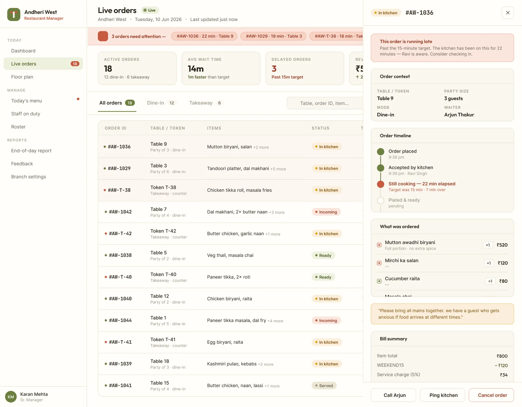
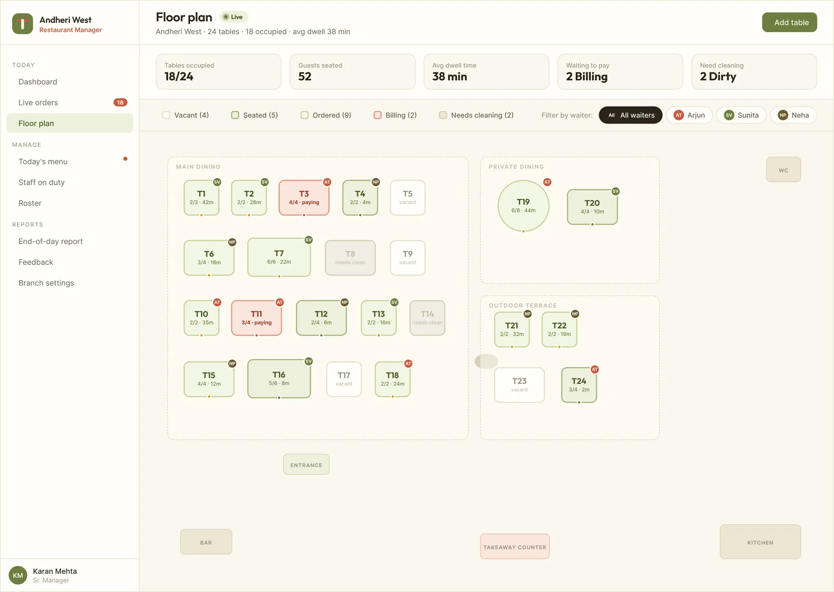
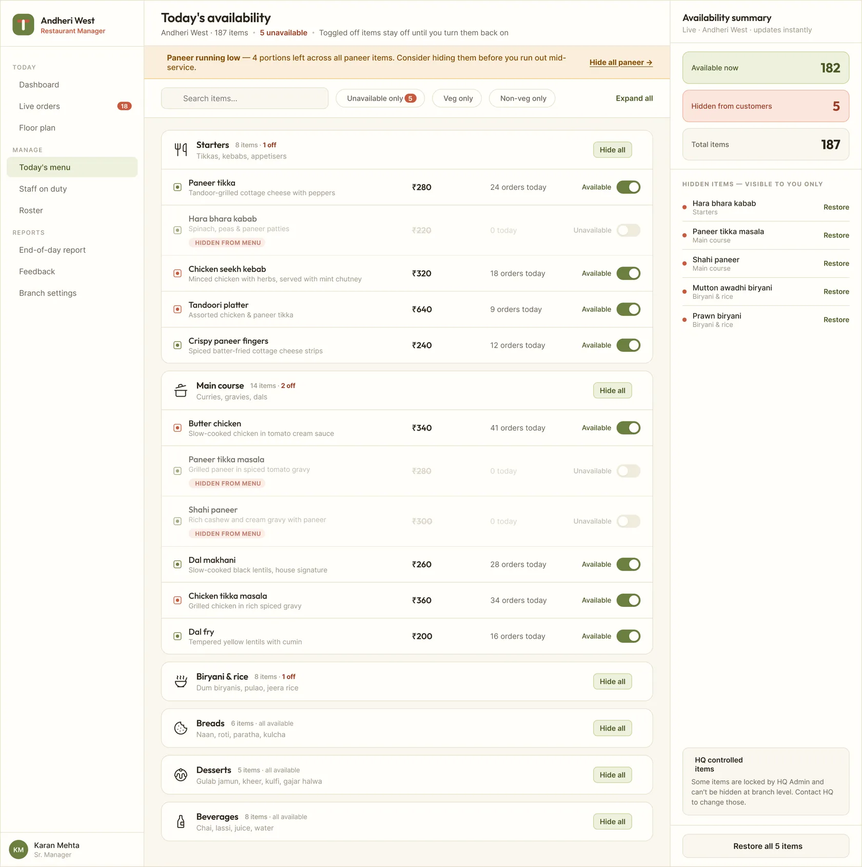
Manager console: floor health at a glance, alerts that come to you, not the other way around
Waiter: less to see, more to do. A task-first app for the floor.
Waiters were the most over-served by traditional restaurant tools, given dashboards designed for managers with too much information they didn't need. I went the other way: scope the app to only their assigned tables, and surface only what needs doing right now. The home screen has two sections. Action needed sits at the top (kitchen ready to serve, bill requested by guest). Active & waiting sits below, for context. The next tap is always visible without scrolling. Manual order entry is there for guests who'd rather order verbally, running on the same backend flow as QR ordering. The only difference is who inputs it.
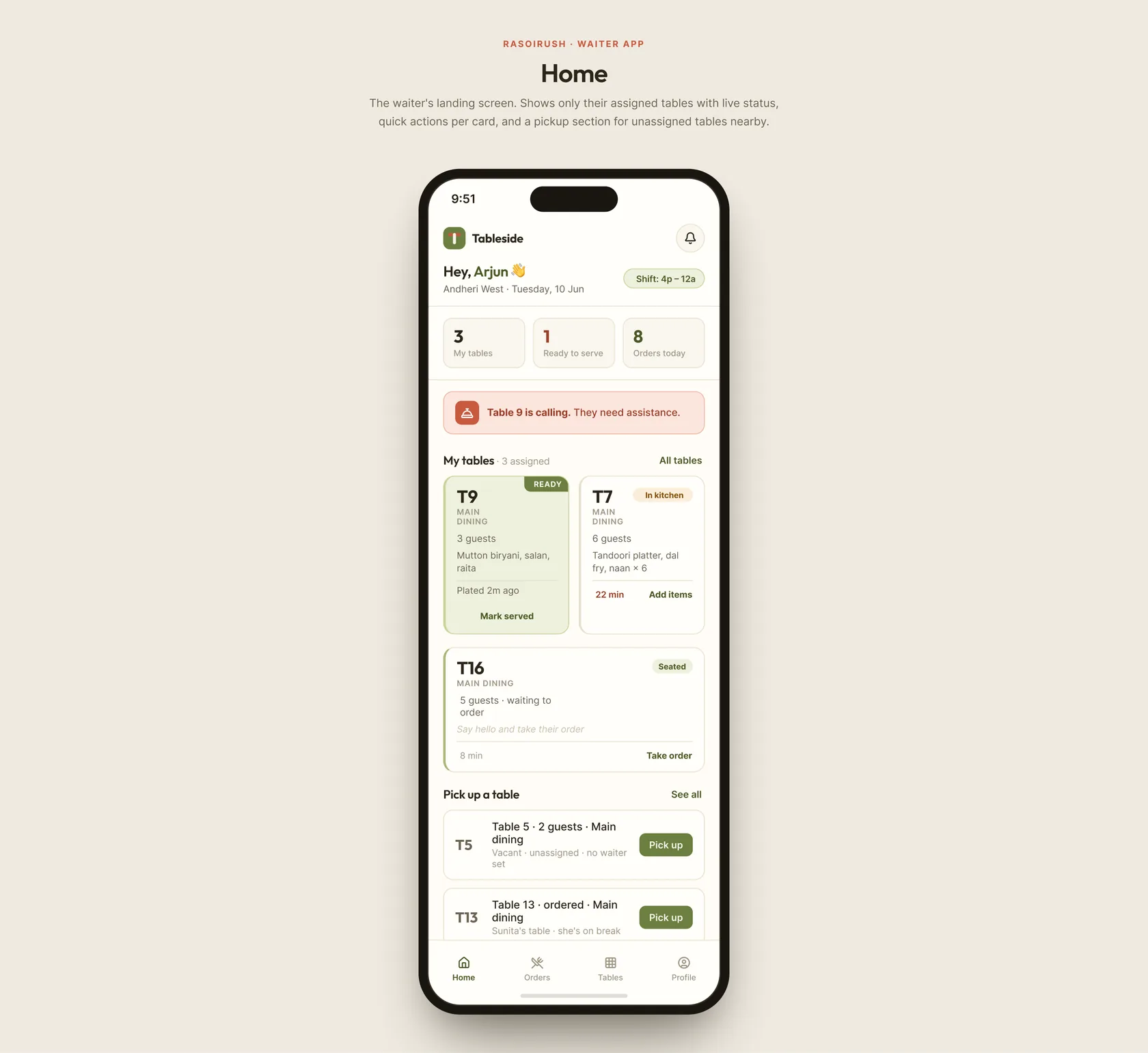
Waiter app: what's next, in one tap, on the tables that are theirs
Kitchen Display System: a UI for hot hands and two metres of distance.
The KDS is the most opinionated screen in the whole product. Most KDS designs fail because they were designed for screens, not for kitchens. I treated the design constraints as the brief: heat, noise, sweat, splatter, distance, urgency, two-metre viewing. Colour is the primary language. Amber tickets are new. Green are in progress. Blue are ready to serve. A chef walking past can tell what's happening from across the room. No reading required. Each ticket has exactly one large action button. One tap moves a ticket through the pipeline. Ticket age sits in the top-right of every card, growing more urgent visually as time passes. The kitchen doesn't need a queue manager. The screen is the queue manager.
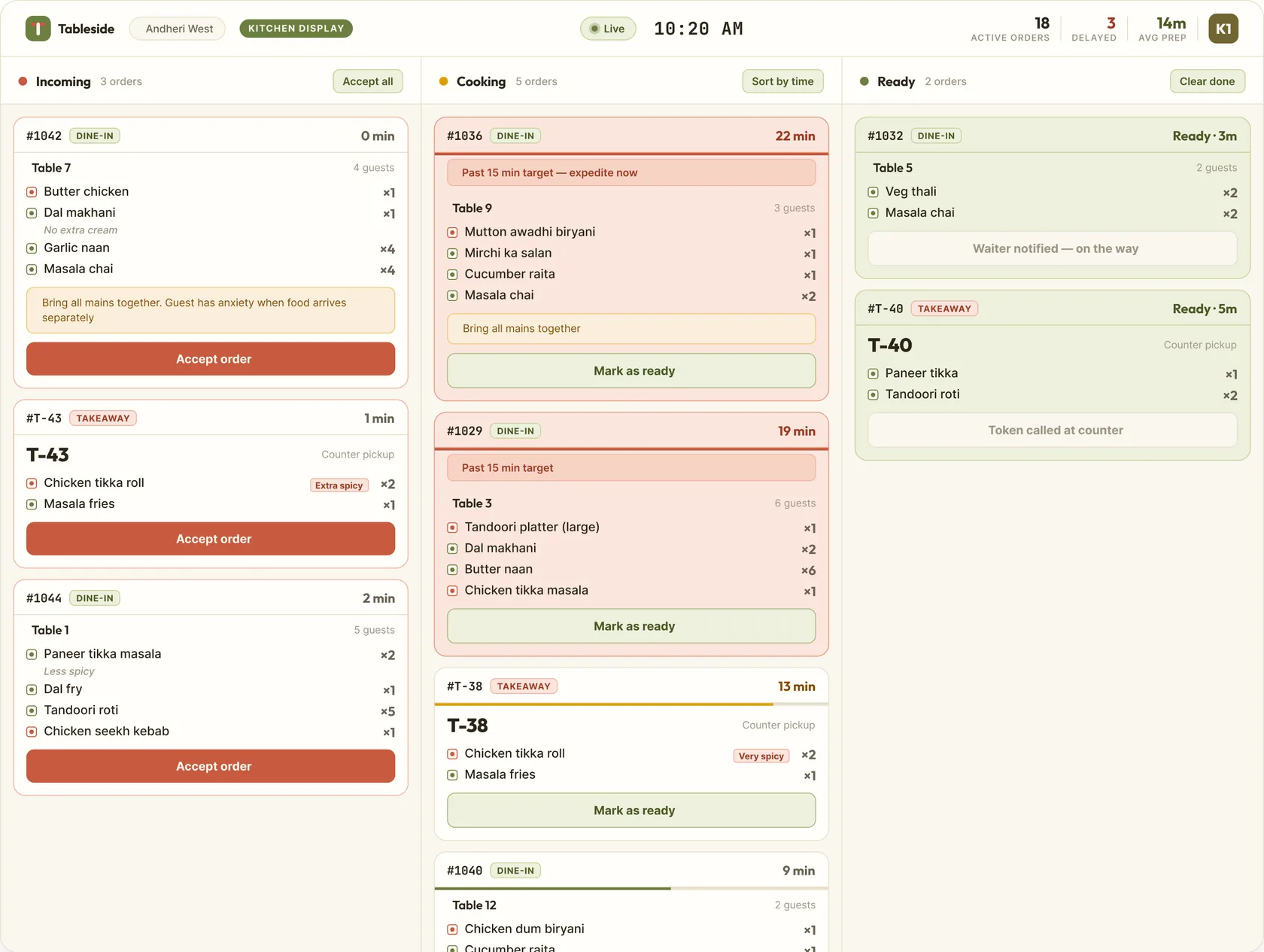
KDS: readable from across the kitchen, one tap per state, ticket age as urgency
Cashier: a bill that arrives already done. Pay and close.
The bill auto-populates the moment a table requests it, directly from the live order record. Every item, every modifier, every discount, every tax line. The cashier arrives to a complete, accurate bill. Their job becomes verification, not reconstruction. Three payment options sit beneath the bill: UPI (warm amber, the most-used default), card (cool blue), cash (deep brown). One tap to choose. Receipt goes to the customer via WhatsApp or print. The table automatically flips from billing to free on the manager's floor map. Discounts and split-bill controls live as secondary actions, present when needed, invisible when not.
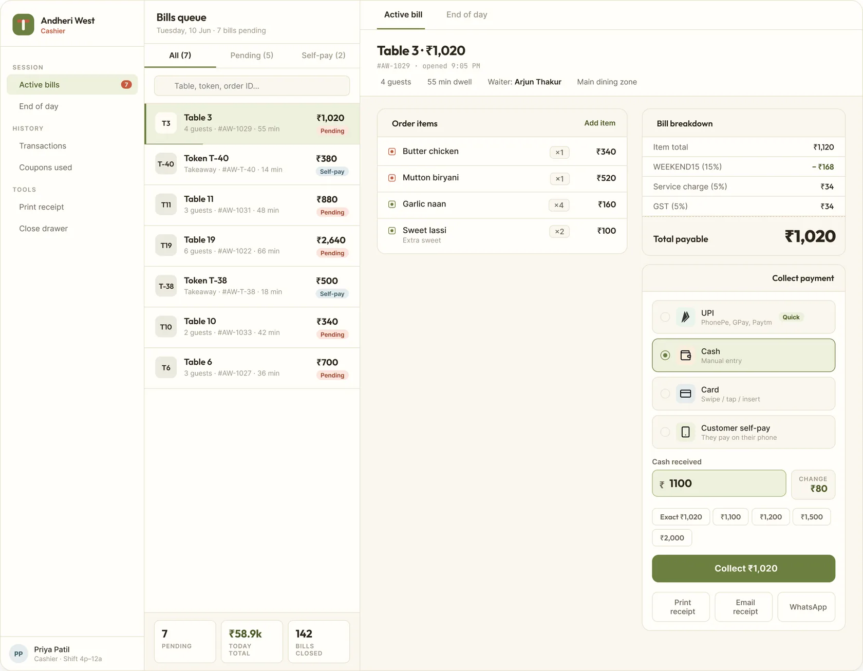
Cashier app: the bill is already right, the cashier just closes the loop
The choices that made the difference
Designing six platforms simultaneously meant constant trade-offs between chain-wide consistency and role-specific optimisation. These four decisions shaped the whole system:
One live order thread, six views on it
Every role reads and writes to the same order record in real time. No re-entering, no reconciling, no reading things aloud across the room. This single architectural decision is what makes the "connected" in "connected dining OS" real, not marketing.
Altitude, not density
HQ sees eight outlets. The manager sees one floor. The waiter sees their tables. The kitchen sees one ticket. Each role gets the density that matches their job, not more. Designing "less" for four of the six platforms was harder than designing "more".
Colour as language, not decoration
On the KDS and the manager's floor map, colour carries state. Amber, green, blue, red. A chef or manager reads status without reading text. This is what makes both screens usable at distance, at speed, and under pressure.
Zero install for the highest-volume user
Guests outnumber staff by 20 to 1 across a shift. Forcing them to download anything would have killed adoption on day one. QR to browser, table auto-filled, no account required. The design constraint set the technical direction.
Guests never had to be taught how to order.
There's no adoption number to cite here yet, no funnel data, nothing measured post launch. What's true by design: ordering required exactly one skill, scanning a code, no download, no account, no waiter explaining how the system works. The paper process it replaced needed three people to relay one order correctly. This one needed zero, for the highest volume user in the building.
Designing for a chain means designing for two truths at once
HQ needs to see patterns across eight restaurants. The kitchen staff needs to see one ticket, right in front of them. These are opposite design problems solved in the same system. Designing at both altitudes at once, chain-wide clarity and single-screen task speed, was the most demanding part of this project.
In food service, speed is empathy. Every second a customer waits, every time a waiter walks to check an order, every time a cashier hunts for a bill, those are friction moments that compound into a bad experience. Designing each one away, systematically, was the heart of this work.
Six roles, six worlds, one live order holding them together.